I've put together a quick table to list all the necessary props we'll need in the video. Thankfully, almost all of these are things that will be able to be found around the house or easily got hold of - the only things that will need to be bought are the chocolate for the car scene and, possibly, the rope. I have luckily found someone who will possibly be able to supply me with some free of charge, but this isn't yet confirmed.
I've also finalised how the rope will be safely constructed:
The neck and main rope will be separated, and the length of rope below the apparent knot will be tucked into the back of the actor's clothing.
At the beginning of the month, Beth and I finalised what attributes we wanted in the costume of the lead in our video. I've compiled these into notes on Excel so that we can refer back to them easily. As the short-list of possible actors for the main role all have folk-like/vintage styles, it keeps any costs down, as they will be able to use their own clothes, providing they are aware of our costume plan:
As we noted down the ideas, I also sketched them out so we could more easily visualise them. I've since inked over the sketch and coloured it roughly on Photoshop to get a better understanding of the colours we want and how it will look in reality:
As most adverts carry over a theme from the album cover, I did the same here. I used the same image as the digipak front cover for the bottom half of the picture. This time I completely edited out the bush on the left hand side, painting over it with a blue picked from the background using the colour-dropper tool. I also extended the tree trunk, painting it in. I added extra branches to the top by selecting sections from the original, uncropped photo.
I kept the font themes the same, and ordered it in a similar way to the album cover - I even kept to the idea of words growing from the tree, this time using it for the "Out Now" text. To keep with the almost illustrated appearance of the picture, I drew in the review stars myself, so they looked less regular.
I displayed relevant addresses and logos on a small dark bar across the bottom so that the information can be seen clearly without interference from the dark branches in the picture.
To get a better understanding of how the pages fit together, I've joined the outer pages together, and the inner pages together, as well as compiling them all into a single digipak template:
Wanting to get a complete idea of what this digipak would look like, I also designed the CD cover. I wanted the CD and the cover behind to correspond and so used the same image on the CD. Now, if the CD was to be put back in, its design would merge with the image behind it, and appear as if there was still only one image.
As with the left inside cover, I wanted to continue the font themes, using fonts in the same way I had for the front cover, writing "This" in the font "Loved by the King", and "YOUNG BOY" in uppercase "High Fiber". I arranged them in the same way I had on the cover, and placed David Gibb's name below, appearing the same as it had on the cover. I even continued the cover's blue theme by using a light blue border around the disk, colour-picked from the cover image.
I also included the relevant symbols from the back cover - the compact disc and DVD logos, and, looking at other disclaimers from the CDs in my house, wrote another disclaimer and fake numbers on the bottom to make it look authentic.
Having storyboarded almost all of our video, splitting the scenes between us, we chose to photograph the first half and put it onto the computer so we could turn it into an animatic.
Using Adobe Premier Pro, we imported all the pictures and, cutting and ordering them, matched them with the audio, adding movement with the "scale" and "position" animation options in order to create camera zooms and pans we imagine would appear in our final video.
Tempo and Editing
Analysing the first 50 seconds of the music video of "Fall for You" by Secondhand Serenade, it's clear that song tempo has had an impact on the shot lengths and amount of shots - within the 50 seconds that contained the first verse and chorus, there were only 20 shots, lingering and long in length to suit the slow, quiet nature of the song's opening. On average, this meant that it would have had about 24 shots a minute - a shot every 2.5 seconds, if it continued in the same style.
The first 50 seconds of a far more upbeat video, in this case Elliot Minor's "Still Figuring Out", differs greatly to "Fall For You" in amount of shots - this time approximately 52 shots for the same amount of time, on average meaning the shots would each be slightly less than a second in length.
It clear from both that as the songs both establish themselves, pick up in mood, and end, the shot lengths vary - the establishing shots of each video have more time taken over them in order to introduce the main singers/scenes. As more instruments are brought in and the mood is fully established, the editing speed again picks up - in the first video to signify conflict as it moves into its second verse and guitars are introduced, and in the second to mirror the increased musical texture as the song moves into the chorus.
Whilst at the moment, the animatic for our own music video only briefly sketches out possible shots and shot lengths, this quick research helps me understand further where we ought to take time in our video, and where we can afford to speed up. For example, the establishing shots and, indeed, the first scene of our video will have a slow editing pace before the music starts, allowing the viewer alongside the character to take in the surroundings - a key feature of folk videos. However, as the vocals kick in and the scene changes and moves towards the chorus, the speed can get faster as more plot devices are introduced. To prevent there being a full-blown dramatic plot, however, this will be broken up with the overriding home-video from the car journey, introduced quickly and flickeringly at first, before brought in fully, as if being overwrote on a home video camera (as during my research on this website, it was suggested that an editor should "split the story, and scatter the plots throughout the video"). Where the music breaks down into the bridge, again the pace will slow, and I imagine that the shots will also slow considerably as the end of the song and video is revealed.
For the right cover, I've used the other of my favourite photos from the shoot:
However, at present it was too dark to use, as I wanted to put some text on this one, informing the consumer of the presence of special features that could be accessed through putting the CD into the computer. To do this, I upped the brightness and contrast, then concentrated on continuing to increase the "brightness" and "lightness" options from the "Brightness and Contrast" and "Hue and Saturation" options respectively. However, after a while it wouldn't go up any more, so I had to overlay the image with a white layer on a low opacity instead. I made sure I was aware of where the CD would be placed by drawing out a rough template.
I made the outlined text in Illustrator, where I could manipulate the pt. size of the lines surrounding the coloured font. I outlined the font with dark grey so that it could stand out against the background - I was still having problems with contrast between the font and the background, so this helped a lot.
I posted the draft of my final front cover spread on my Facebook page, and gathered a few comments about things I could improve on:
Having both reviewed the comments and looking again over the design myself, I edited it slightly - cropping it to make it more square, shifting the disclaimer text along so that it now overlays a paler part of the photo where it will be easier to read.
Wanting to continue the tree designs from the cover, I chose my favourite skywards photos from the recent shoot in order to fill the inside covers. I did try to use the shoe-tree photos, but I felt that the colours and the style didn't fit what I had done with the front cover.
For my left inside cover, I edited this photo:
In Photoshop, I rotated them image then raised the brightness and contrast in order to produce a paler background, and put it into greyscale. I then cropped the right side down so it was roughly the right shape for the digipak template and, in order to create a split between the top and bottom halves of the photo, I painted over some of the branches. This allowed me then to use the lasso tool to select the top half of the photo and move it up the canvas, then separately select the bottom half of the photo and move it to the bottom of the canvas. This had given me a large central space for me to insert lyrics, or any sort of text.
I wanted my text to be more understated than the front cover, but still to have the same theme. I used the same font as I used for "This" on the front cover - "Loved by the King". The other font I'd used on the cover, "High Fiber", was too straight and regular for the scrawled appearance I wanted. I coloured it grey instead of black so it had a much gentler appearance. I put branches onto the words in the same manner I did before - selecting parts of the photo, layering it via copy, then aligning it against the text. This time, I also selected the branches with the magic wand tool and filled them grey to match the font. I didn't put them on every letter this time - I had tried, and found that it became too complicated and messy-looking. I chose to write a quote from the title song, "This Young Boy", and not the full lyrics. I had tried, but I disliked the amount of text and, as I was trying to keep a relatively minimal approach, felt that one quote was enough.
I wanted this and the other of the inside covers to keep to a greyscale theme, and generally be slightly darker in mood, reflecting the contrast of brightness and darkness I hope we'll portray in our music video.
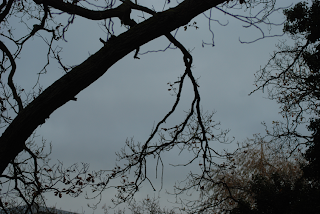
Having been able to go back out and gather photos in the woods, I'm now able to design the outer cover of my digipak.
I knew that for both the front and the back of my digipak I wanted a single, unbroken image that continued across both pages, and wanted a trailing branch to link both sides together. Returning to college after the location shoot, I encountered this branch which, with some flipping and rotation on Photoshop, was perfect for this purpose.
In editing, I cropped it down to a practical size with roughly the dimensions of a final outer cover and, using the brightness and contrast options, made the image much brighter and clearer and contrasting the branches as an almost silhouetted black, also using the hue and saturation options to make the sky appear a much stronger blue. I found I had to erase some of the branches, though, to allow enough room for the title and other text - this was quite difficult, as I had to paint over it, using to colour-dropper tool to ensure that the colour I was painting with matched the sky. I also had to use smudge and blur tools to then disguise the boundary between the paint and the photo.
I had initially intended to simply overlay the photograph with my title text, using the fonts "Loved by the King" and "High Fibre" which I favoured in my initial experimentation. However, as the branch was such a dominant feature and took up so much space, I found it hard to position it in a way that didn't mean that the words were obstructed. Instead, I decided to incorporate the words into the branch. Erasing more smaller branches to make room, I lined up the text with the branch and, where the letters did not touch the tree, I painted in new branches to make it appear that they were growing out of it. I even selected other branches from the image and, copying them to a new layer, dragged them onto the letters, flipping and resizing them so they could not be located easily elsewhere on the image.
To allow myself more clear space for next on the back cover, I erased another patch of small branches, and initially aligned my track list to the right, typing them all in lower case in a grey colour, so they didn't have the same dominance as the title, and also in order to match the style in which I presented David Gibb's name - also lower case and grey. However, after experimenting with positioning, I found I favoured a central alignment more, seeing as the title on the front cover was centrally aligned too. However, the presence of bushes and branches made making the text readable extremely difficult. I eventually chose to use a circular gradient to put in a fuzzy white background on a lower layer, keeping its opacity low so it didn't completely blot out the background.
Finally I added things to the cover in order to make it appear more authentic. I found a barcode, and, looking on the backs of my own CD's, found disclaimers that I copied out, giving it an official appearance. I included the "compact disc" logo, as well as the "DVD" symbol, as inside I want to refer to some DVD bonus features on the disc - "making of" or "behind the scenes" clips.
Completed Cover Design - First Draft
I've posted this image onto my Facebook now, in order to get feedback from others so that I can improve it. Having posted it, I've noticed that the sides are a little too wide, so this is something I'll need to revise.
This week, I met my targets for learning new technologies. At the beginning of the week, me and my partner took out one of the new cameras, intending to learn more about them. During our mini-shoot, we took the shots we needed to create some splitscreen shots, and also began to experiment with the manual focus.
We imported the videos into Premier Pro, and began experimenting first together, then independently with putting together the necessary parts of the videos to pull it together into splitscreen. At first, we found this difficult, as we weren't sure where to begin, and so did some research for tutorials on Youtube, coming up with this video:
It was easy to understand and, having dragged the "crop" option onto our videos, began with splitscreen. We found immediately that we hadn't made the camera still enough, as it must not have been properly anchored to its tripod. Due to this, there is a slight camera shake that causes the splitscreen to move slightly and reveal the technique. However, I have after this discovered the "anchor" tool, where I can anchor two videos together, and so hopefully in future, if there is a camera shake, the anchored videos will move together and not ruin the shot.
We also began editing the experimental focus shots we took, filling in my second target - I found options for tinting, brightness and contrast which I used on my focus experiment shots, making the colours more contrasting, and brightening them, as they were a little dark before. I also stumbled across other techniques which, though I didn't use, would be useful in our final music video - lens flares, gradients and similar effects. I also re-learned how to use key frames for gradual fading/increasing of effects (e.g. the increase of brightness at the end of my video below, and the fading of the music). I also found the option for video noise and ageing effects on Premier, meeting my final target without having to explore After Effects.
Having edited each shot how I wanted, I compiled it into a short video to note my progress:
I can now use this as a benchmark for future experimentation, and as something to refer back to if I need it.
Inspired by the work in the woods, I returned home and took some more skywards photos in the small wooded area that divides my street from the main road:
Whilst providing me with material I could possibly use for my print production, this has also allowed me to consider more scenic shots that we could use in our music video.
This week Beth and me went back out into Nunnery Wood in order that we might both gather some location shots. I also took this opportunity to gather some photos for my print production work. During this, we found a perfect location for the part of our video where the boy enters a clearing and is surrounded by the dead people which I photographed to refer back to later:
I also pursued my idea of the shoe tree for my print production work, borrowing Beth's brogues due to their vintage style and hanging them from various places.
I had initially wanted the above image as the cover of my digipak, but now, considering the dark background which would make finding a contrasting font style and colour hard, I think I will probably use this as an inside cover picture, using blur filters to make the image more indistinct, perhaps, in the same way that Muse's photos for "The Resistance" are.
As I left the woods, I tried taking a skywards shot, in the same style of the video shots in Bon Iver's "The Wolves", coming out with this:
It's dark at the moment, and needs some editing, but I think this might work well.
This week, I'm going to be focussing more closely on particular technological techniques I can improve. Alongside my continuing creative progress with my print production and music video planning, I will also try to follow three targets for myself:
Try out the splitscreen technique on Adobe Premier Pro
Experiment with colour filters and saturation on Adobe Premier Pro
Research possible techniques for Adobe After Effects to give shots an aged appearance
All these will be helpful preparation for when my partner and me begin to edit our music video.
In this week, I've started working in earnest on my Print Production task and, with only vague ideas of what I wanted, I began to experiment on Photoshop. I know that I want to include some sort of woodland imagery so, for now, I've been playing around with a picture of woods that I've found on the internet. After building up some textures with low opacity dry-brush style brushes (and erasing with the same types of brushes) to get a mottled effect, I placed the image beneath it, then altered the colour levels and opacity. Having done my research on fonts that I liked, I used my favourite as the centre feature of the cover, experimenting with alignment and font size. I know that I want to keep this elongated font style, even if my design changes.
Though I'm happy with this, I think I might use a simpler design. Whilst I was looking for a woodland image, I came across a "shoe tree", a tree that is laden with shoes. I thought this would be a useful reference to the use of hanged people in our video, without putting anything gruesome on the cover, and so am going to try and pursue this with my next attempt.
Sir Ken Robinson & Creativity
Sir Ken Robinson thinks that creativity is based on failing or doing things wrong. He says that children are unafraid of being wrong or making mistakes and that as we are educated we are made to be scared of failing or doing something wrong or different and this quells our creativity.
In experimenting in this way, I'm bound to get things wrong or encounter products of my ideas that I'm not happy with. I need to not be afraid to make these mistakes, as I'll be able to learn from them in order to produce the best possible digipak.
To get a better idea of how digipaks are successful in their presentation of their bands, I have began to look into different digipaks, analysing them and understanding how they are relevant to their corresponding artist and genre. Muse's album digipak for "The Resistance" stood out in particular.
Muse - The Resistance
Outer Covers
Inside Covers
Disc
Analysis
It's interesting that Muse have taken an illustrative approach to their digipak front cover; most album covers use promotional-like photography of the band or subjects relevant to the band in order for a viewer to identify with them. Indeed, given their alternate music genre, it's obvious that they have chosen a similarly alternate route in digipak's presentation. Even the photos of the band defy the mainstream norms. Whilst most pop artists define their albums by using their own image, clear and looking straight at the camera (and thus targeting the audience) in a studio-type location, Muse's photos are black and white, blurred action shots, suggestive of a constantly active lifestyle, and not clearly staged and falsified as some mainstream cover photos may appear; with run-down urban settings, these are far from the glamour of a pop album, making the album's name, "Resistance," perhaps more symbolic in its ability to resist the mainstream expectations of an album's appearance and the music it contains. Indeed, the first track, "Uprising" states, "they will not control us." The bleak colours also shadow the dark, dystopian mood of many of the tracks' lyrics.
It can also be observed that there's a lot of symbolism in the cover's image. The multi-coloured geometric structure surrounds the centrally aligned Earth, with the side of the path producing reading lines which lead the eye from the bottom to the centre of the picture, back to the planet. It's impersonal; all we see of any person is a silhouetted form, leaving us with no idea if this person is old or young, male or female, a contrast to more mainstream albums, whereby the target audience is generally embodied by the cover photos/images. It can be understood that Muse's audience is not as particularly age or gender specific. Instead, by focussing on the Earth on the cover, a sense of universal importance is instead portrayed. The stars in the background of the picture link to many major Muse themes, and could be intertexually referring to Muse's older albums such as "Black Holes and Revelations", which had strong space themes. Theme consistancy is even displayed in the use of text colour on the album - just as the cover's colours graduate through a reverse-spectrum of colour, from purples through to oranges and reds, as does the track list and the title on the spine, allowing it to stand out against the otherwise bleak colours. It also shows how the cover image continues on to the disc, now in an utterly spherical and colourless form.
It's clear that Muse is a well established band; they have no need to clearly brand their material and so, wheras a new band may have a large band logo or title to clearly promote the artist, this cover shows both a small band logo and title, leaving the image as the prominent feature. This suggests that the band has a large enough following for fans to seek the music out, rather than rely on simply spotting it on a shelf.
In contrast with the more alternative approach from Muse, I've looked at how a mainstream artist would approach digipak design too.
Contrary to Muse's illustrative approach, the album for Se7en uses photography to portray the artist. A close-up head-and-shoulders shot of the artist establishes his image as a branding device - looking directly at the camera, he establishes a connection with and targets the audience. This photo reoccurs on the CD design, too. The colours are muted and in almost sepia tones, and the background is dark shadow. This, combined with the artist's unsmiling face connotes a sense of seriousness and darkness.
The colour themes are echoed in the use of font colours - using a yellowish colour for Se7en's name, and also giving a shine to make it appear as gold, suggestive of riches - "bling" - and all other words are similarly given a metallic sheen for presumably the same purpose - the appearance of expense and class.
In order to gather feedback for our music video plans so far, me and Beth put together a note on my Facebook page, which included the previously posted final concept, the song and some information on possible costumes and locations we would use. At the end of the note, we devised five questions that should help us continue to tweak and improve our plans. These questions were:
Would you recognise this as a folk-genre music video? Why/why not?
Do you feel that this video targets your age range? How/why?
Does this sound like an authentic music video that you would expect to be broadcast on TV? Why/why not?
Would you watch it? Why/why not?
How would you improve it?
I then tagged the people who most closely fitted the target audience for our video so that we could gather the most relevant replies. These were some of the replies:
Everyone responded very well to the setting and appearance of our video, and found that they could draw links with the folk genre easily due to the stereotypical elements we included to enforce our genre - natural, woodland settings, for example - which meant that the genre could be deduced even without the music, as noted by Chris in the comments.
Whilst two of the main three who commented suggested that the age range for the folk genre should be more generalised, the youngest of the three, Jack, suggested that people of his age would be more interested in more mainstream videos and themes, which enforcers me and Beth's understanding that we should be aiming our video at a more mature audience.
What was most important for us to understand was how believable and authentic our video appeared; all three agreed that from what they could see of it so far, it was indeed authentic, but perhaps, as it had dark themes, it ought to be aired later. This reading of the text is something me and Beth will perhaps need to attempt to alter - although our video has an appearance of darkness, there is supposed to be an air of quirkiness and surreality to alleviate this and make it more accessible. We'll have to think of a way to bring through this lightness in a more dominant manner.
As these people are representative of the sorts of audience we hope to target with our video, it was also important to understand if the video would interest and engage them. Whilst, as Chris pointed out, the watchability of a video is partly based on the music it is representing, he also noted that the themes and imagery were "intriguing" and so would watch it out of interest in the imagery. Jack said that he would watch it due to its narrative plotline, which therefore appears to attract an audience, as people would be obliged to watch it to the end to seek the resolution of the narrative sequence, and Emma noted that she would like it simply due to its genre and that the video was representative of it.
Whilst it seems that most were happy with the video's concept as it was, which is cheering, Chris suggested that perhaps we could make less of the repetitive untying of the ropes, unless we could find ways to vary it. This will be very helpful when we come to shooting and editing, as we now know how to approach these shots and how to add interest to them, as well as knowing how many of these shots to add to the final cut so as to not get too repetitive.
Working with Beth, both in class and over the internet, and referring back to the feedback from the pitch, we worked our ideas into a final concept that we can refer back to for our music video storyboarding.
This Young Boy
Finalised Concept
Main character pushes his bike up the path (no music). Arriving at the top of Red Hill Lane, he looks around.Pan shot of landscape around lane (POV). He climbs on his bike and, kicking off, the music starts. From different points of view, we watch him cycle down the lane. As he nears the railway bridge, the lighting begins to shift and become more surreal. As he rides beneath the railway bridge, the image is blown out with light, and we lose visuals.
He is suddenly in woods, the lighting dark and with muted colour. He looks around. Canted angles, circling tree shots, more POV. He begins to walk the path, still singing. He halts. There is something dark and out of focus behind him. Shift focus: from main character, to body, back to him, to the foreground, where rungs of ladder can be seen. He calmly reaches his hand towards the ladder without looking at it (and from now everything he does has a slightly quirky, almost -but not quite - humorous approach to offset the darkness). He turns, the ladder tucked under his arm, and approaches the person. He props the ladder against the tree beside the body and begins to climb. Close up of hands undoing the knot on the branch. See the rope slip away (slow motion). POV of looking down over the branch, see the body splayed on the ground. Low angle shot looking back up at the main character in the tree who begins to climb down. Back to the first high angle shot of him leaving the ladder. Picks up body and props it on its feet. Close up of face, eyes opening suddenly. The revived person follows at a distance as the main character picks up his ladder, sticks it under his arm and walks away.
Switch to storyline 2. Lighting is bright and warm. Establishing shot of rolling countryside taken from inside a car (Note: when shots are taken from inside a car, this is a family holiday video – handheld shots). Also shots of the countryside around. See car in background. Sound of song is lower. Radio turned up and sound returns to full volume. Long shot of location, car goes by, zoom in on a tree.
When zoomed out, we are back in the wooded location. Side shot of main character leading a procession of about 4 dead people. Time begins to move faster, and in a series of faster shots, we see repetitive actions of him placing his ladder against various trees, his hands picking at knots, the bodies dropping. From a low angle, only the newest dropped body is seen, and the feet of others in the background. The main character leans into the shot and helps the new person to their feet. As they rise together, the camera follows until, at normal height, the camera is looking across a crowd of people.
The bridge begins. The main character is alone in the centre of a clearing. The camera circles him. As he looks around, the dead emerge from the trees. This is intercut with a short fragments of the continuing storyline 2, shots of the car turning into an estate, shots of inside the car with the family laughing. Then back to the main storyline. People continue to emerge. This continues in this manner until they, at a distance, surround him and begin to slowly dance around him, circling. The camera spins from the centre of this, flashing past each face.
They stop, and the circle parts. The main character’s eyes fall on something out of shot and, the crowd of the dead split into two equal ranks on each side, they follow him, though the camera angles deny the viewer of what he is seeing, showing him approaching the camera from a high angle. Finally a reverse shot is provided, a close up of dangling feet. There’s a shot back of the main character, whose eyes travel up the body. In splitscreen, he looks at the face – it is a dead version of himself. He steps backwards, out of shot. There are still interrupting shots of storyline two. Slowly, he climbs his ladder. As there’s another close up of his hands on the knot, and it releases slowly.
As it does so, there’s a final sequence of the car, turning a corner, and travelling down a short road. Jumping to inside the car as it approaches the bridge, we see the main character on his bike, going underneath the other side of the bridge. It cuts back to the body falling the final foot to the ground as faint sound of the car brakes screeching is heard. A high angle POV from the branch looks down at the body, and the crowd of dead watch. From ground level, we see the dead version of the main character’s head and shoulders. A match-on-action, we then see the boy in the clothes he wore at the start of the video, lying in a similar position on concrete, the wheel of his bike spinning in the foreground. In the last moments, after lying still as if dead, he opens his eyes.
Having completed our pitch, we were given back the anonymous forms that the class had been given to review our video ideas. This has been helpful in aiding our understanding of how we can improve.
The class responded well to our audience research, noting that it was "realistic" and "well researched", and, commenting on the originality of the idea, noted it was "different" and "entropic", a response Beth and me are very pleased with, having set out to overthrow redundant themes and aim towards something very quirky and interesting in its originality. However, there was a comment that suggested it was similar to Mumford and Sons. This is an opinion that I disagree with quite strongly, though I can understand where similarities lie in terms of mise-en-scene (the costumes and settings) perhaps, though this aspect is unavoidable - we still need to retain some of the redundant characteristics we pinpointed in our music video research to ensure that our video can indeed be recognised as a video for folk music.
Naturally, with the setting and concepts included in our music people, health and safety was questioned a lot. When asked about how achievable they thought the music video would be, most of the class expressed doubts about the "hanged people" we wanted to include in the darker scenes, asking how we would manage it. This was, however, already a point which we had carefully considered: we will not have a rope directly connecting a person to a tree. The rope which hangs from the tree and the rope that circles the characters' necks will be two different entities, cancelling out all risk of accidental injury in this respect. The shots of the hanged people will not show the full body at the same time. Rather, if we want shots of the upper half of the body, the actor can stand on a chair, or even on the floor. If we want shots of feet, we will find a low branch and get the actor to sit and dangle their feet in the air. Of course, climbing the trees is also potentially dangerous, and we will be mindful in picking appropriate trees with branches low enough to present little danger of falling and sustaining serious injury. In the woods, we must also be careful of tripping hazards such as roots and sticks, and be sure to keep warm. All we really need now to keep in our considerations is the weather - filming outdoors with unpredictable weather could seriously harm our shooting time scale if the weather makes a turn for the worse, and we'll have to be mindful of this.
A few people commented on the lighting. If we're in woodlands, the possibilities are that the shots will be much darker than intended. As we can't really take studio lighting into the woods, we will be careful to choose areas that are well lit and edit the shots in post production to rectify brightness and contrast issues.
Overall, almost everyone everyone agreed that it sounded like a realistic and exciting idea.
With our initial research and ideas compiled, the class was requested to present their ideas to each other in the form of a Pitch. Whilst some people used Prezi and others cut their ideas into a video, Beth and me put together a Powerpoint slideshow in order to present our ideas.
Pitch Notes
Genre and Taxonomy
We wanted our video initially to have all of these above attributes - it was certainly going to be folk, matching the genre of the song we'd chosen and, as including rural scenery is a large feature in folk music videos, the choice to also make our video relatively scenic is an easy one. We want it to tell a story, so it will have a strong narrative structure, but we didn't want to follow a redundant path. Following the idea of binary opposition suggested by Levi-Strauss, we wanted to contrast themes of light and dark, life and death, and, attempting to get away from redundancy, had initially thought our video to be disjunctive due to its rejection of the lyrics. (However, since then, as our ideas have developed, it's clear to see now that our music video will instead amplify the meaning of the video, as it too talks of death and has dark themes, despite the cheery nature of the song).
This is David
David Gibb, the artist of the song we're going to be using - "This Young Boy" - is a clear example of his own target market, who are likely to be students between the ages of 16 - 21, with indie/vintage fashion tastes and likely to shop both at independent vintage shops as well as places such as Urban Outfitters and Cow. The target audience is likely to be in the C1 - A range of the demographics, and, psychographically speaking, are likely to be hedonists and aspirers. As lovers of folk music, they would probably have a greater appreciation of the outdoors, as well as enjoying music festivals, drinking and perhaps smoking.
Inspiration and Influences
In this, we referred to our initial music video research and displayed the music videos for Mumford and Sons' "Winter Winds" first, and we stated what appealed to us and what we could carry across into our own video, as well as what we disliked.
We particularly liked the mise-en-scene in this video. The costumes were perfect, and easily displayed the vintage/indie style we'd picked up on for our target audience. The settings fitted the conventions of a music video well too, with many scenic locations - country roads, cornfields etc. It also showed us that the weather and brightness didn't have to be an issue - this video seemed shot beneath a very dark sky which we'd be likely to face when we shoot our own video, it being winter at the moment. Time was taken over particularly picturesque shots, such as the carrying of a chair and guitar through the field. However, there were aspects we decided we definitely didn't like. There was much use of fade-to-black transitions. Both me and Beth felt that this ruined the effect of the video and didn't fit. We also agreed that the video felt too cheesy - whilst it was clear to see the band were having fun, in some shots, the close up shots of their smiling faces as they ran up the road with wind and bunting trailing behind felt far too over the top and cheesy.
The music video for Bon Iver's "The Wolves" was also well liked. It fitted well with the idea of scenic locations, and had a majority of its shots dedicated wholly to attributes of the scene - trees, paths, the sun through the trees etc. We liked how despite the low amount of narrative structure and variation, it still held our attention, and some of the shot types, such as a spinning extreme-low-angle shot looking up through the trees at the sky were highly effective. It also showed, again, that shooting in winter doesn't have to be a problem - snow appears to work well on camera. However, we did feel that the scenic shots were a bit much, and more time could have been devoted to the artist or at least in developing a more followable plot line.
Stornoway's "I Saw You Blink" was also very much enjoyed - it once again had the mise-en-scene we liked, and we appreciated how comedy was made mostly subtle - it did, however, sometimes come out as too cheesy, especially near the end of the video where they pretended to play instruments made out of other objects, which also showed particularly bad lip-syncing. The focus techniques in the video were very nice - we liked how they, for example, focussed on a branch in the foreground whilst action happened in the background of the shot. The narrative threads also wove together well.
The Wickerman
As already explained in my research, the 70's version of "The Wickerman" was the perfect example of how a bright folk song can be twisted to fit darker themes, and proves that our own attempts to do the same can be brought off successfully if done right.
Existing Video
To ensure that we were aware that a video is already in existence for our song choice, we showed the approach that another had taken to the song in the creation of the video. Whilst we want ours to be very much narratively driven, the existing video is driven much more by the progression of the visuals, the changing of outfit/body paint designs for example, and appears interestingly abstract in approach.
The Moodboard
As already explained here in my blog, Beth and me put together a moodboard in Photoshop to highlight aspects of our video - the contrasts between light and dark, the woodland - and possibly other - settings, as well as ideas for props, other mise-en-scene etc.
The Concept
Beth and me found that when other people did their pitches, they explained very little about the content of their video, and so we instead clearly presented our ideas. We know we want a clearly narrative structure, and want to contrast life and light with death and the dark. The central character has moved from life to a darker world, perhaps in between life and death, in a woods, where he's confronted with hanged people that he cuts down, the action apparently bringing these hanged people back to life. We want the video to build to the end, where he faces a dead version of himself which he also cuts down, ending the video. It's the concept that this boy's "idea" has saved the lives of others and his own.
Location Scouting and Dummy Shots
Missing from the internet version of the slideshow, I had embedded video clips of the location scouting and trial shots. In our experimentation, we found particular shots we liked (mimicking the rotating skywards shot as seen in Bon Iver - The Wolves, low angle shots of feet, extreme high angle shots of walking feet, landscape pans etc.) and displayed them to give the class a better idea of the locations and shot types we would be using.
I will try to edit together these clips in Premier so that they can be seen online.
Techniques
We've chosen particular techniques that would really make an impact on the effectiveness of the video. Splitscreen will play and important part at the end, when the character is confronted with himself.
To highlight the differences between the light and dark scenes, we would use colour filters to add a brightness and colour saturation to the "life/past" shots (as no doubt when we film, it will be dark and overcast, being winter), and also muting colour in the "present/death" shots to connote a greater feeling of lifelessness.
Asking Permission
We contacted David both through his Myspace page and by email, and managed to get a reply. As long as we show him our final video, we're welcome to use the track.
Health and Safety
The nature of our video presents a lot of health and safety issues. Filmed mostly in the woods, we will have to be aware of trip hazards and, as we may be using ladders and climbing low branches, we will have to be very aware of the stability of the tree, as well as obvious falling hazards. Due to it being filmed in winter, we'll also have to make sure that all of us are dressed warmly and don't remain outside for longer than is necessary.
Obviously, our big health and safety issue is how we will achieve the hanged people. We had initially thought about full-body shots, throwing around ideas of dummies, but this seems both too complicated and impractical, and have ruled out these sorts of shots for it. We also briefly considered harnesses, but this again is too complicated. Seeking advice, it will probably be best to shoot head and shoulder shots whilst the person is standing on a chair, and feet shots with the person hanging from a low branch.
We've also considered how the rope will be made - the neck loop and the main rope WILL NOT BE ATTACHED. Rather, the long rope will be tucked into the back of the person's clothing. This eliminates all choking/lethal hazards here.
The Outlook Web App that we use to communicate with each other also has a convenient calendar function, which allows me to put in events, their times and dates, and allows me to clearly see the length of time they span. With this, I should be able to keep on-time and organised as my planning progresses.
On this calendar function, there's also the option to share the calendar. In this case, me and Beth began planning our dates and times on her computer, and so it was her calendar. However, she was then able to share her calendar with me, so I could see it on my calendars. This will also prove useful later, when we have to organise many people for our music video, as we can simply share the date/time/place information clearly and easily.
This will hopefully be the span of events for the rest of November:
And December:
I can also easily add in new events/information if any comes to light.
Having settled on David Gibb's song, "This Young Boy," we listened to it repeatedly and then began noting down ideas through "synesthesia", jotting down what first sprang to mind. With themes such as ageing, death and loss, contrasted with the happy, folky music, we came up with a range of ideas, particularly for setting - certainly a woodland. With the darker themes in the lyrics, though, we chose not to take a redundant approach to the video, and instead looked at the darker representations of music, and were made aware of the 1973 version of "The Wicker Man", who similar combined happy folk music with dark visuals.
Inspired, me and my partner realised we wanted some sort of representations of life and death, and a clear divide between them - life - and possibly the past - represented by saturated colour, warm weather and lighting. Death, on the other hand, would be represented with more muted colours, and would take place in a wintry woodland setting. Whilst the warm life scenes would have groups of friends, perhaps having a picnic, the character in the world of death would be haunted by hanged people in the trees. Based on our ideas, we created our moodboard for our music video.
I've teamed up with Beth Money in order to create a music video after a sort of "speed-pitching" session, where we had a few minutes to exchange ideas with different members of the class before switching, in order to get an idea of what other people were interested in working on, and also whose ideas would fit my own. I was hoping to look into the Indie genre, but wanted something quirky and certainly non-mainstream, as it would be a fun genre to explore artistically. Beth similarly wanted something quirky and interesting, though something more towards the folk end of the Indie genre. I liked her idea of possibly making a darker video - I had previously been thinking about something relatively bright/comic, and she was interested in the sort of video techniques I wanted to explore - the use of split screen and colour filters for example. Now, settled on folk music, we have began to explore what already exists in the range of music videos for this genre. Of those we researched, we particularly liked:
Bon Iver - The Wolves
Mumford and Sons - Winter Winds
Stornoway - I Saw You Blink
Each video contains aspects that we'd really like to explore in our own videos and has given us some idea of the general characteristics of a folk music video:
A considerable amount of scenic shots
Rural settings - fields, country roads, woodlands etc.
Attention to costume - a mixture of indie and outdoor clothing, sometimes vintage style - skinny jeans and waistcoats are mixed with suits, body warmers, duffel coats and gloves
Scenic/natural exploration
We then found this artist:
David Gibb - The English Retreat
We really liked the style and character of the songs and, indeed, the quirky nature of his videos which incorporate many of the common themes we've noted - rural settings, indie/vintage clothing etc. We explored him more on his Myspace page and discovered that he was unsigned and so would be much more likely to allow his music to be used and be much easier to contact. We went through the list of his music on his page and had initially chosen the song "Apple In My Teeth" to make into a video due to the lack of one already existing, which meant we would be in no way influenced by any existing material. However, after initial planning, wanting to go along a comedic narrative, we decided that we'd rather go back and re-explore our desire to pursue darker themes, something that this song lacked. We didn't want to abandon Gibb as an artist. We went back over his music and found "This Young Boy", and this is now the song we are convinced we will use for our video. It does, however, have an existing music video:
However, having looked briefly at this video, we know that our own ideas are developing in a completely different direction to this, so there should be no danger of accidental copying.
The music video for Take That's "Said It All" is interesting in its use of binary opposition (as understood by Levi-Strauss) and its challenging of redundant roles to instead cause high levels of entropy, and causing the video to differ from what would generally be expected of a more mainstream band's music videos.
The beginning of the video establishes immediately the more sombre mood of the song - a series of close-up shots of the band members' faces (as specified by Goodwin to appease an audience) reveals them to be painted like clowns. They do not, however, conform to the redundant stereotype of clowns - instead of painted smiles, their faces are painted with unhappy, unsmiling expressions; the act of turning this norm on its head from the expected to the entropic will therefore catch the view off guard, and will more greatly emphasise the sadness that is supposed to be portrayed. Similarly, where a viewer would usually associate a clown with bright colours and the carnivalesque, the lighting is instead dark, and the colours are muted as, indeed, are almost all aspects of mise-en-scene - the costumes are mostly black and white, and the settings are revealed to be shadowy and run down connoting a sense of decay to match the lyrics' depiction of a relationship in similar disrepair and decay, identifying the video as amplifying according to Goodwin's suggestions of categorisation. This initial entropy leads to a sense of unease in the viewer when they must see these unhappy, unstereotypical clowns still conform to their redundant tendencies - performing onstage, connoting falseness.
There is also a sense of pensiveness in the video caused by the use of slow-motion and symbolism; the theme of mirrors at the start of the video can be understood as being self-reflective, the personas that the band have taken on perhaps attempting to understand themselves. As the clowns falsely perform onstage, the slow motion drags the scene out, allowing the viewer more time to understand it. Slow-motion similarly used simply when the artist is pacing through the scenes lends to a feeling of entrapment, further exaggerated by the repetition of stationary shots - the one of the band all sat against a wall for example - throughout the video.
Although there is not a developed narrative plotline (the video more devoted to simply a string of performance scenarios) which means that matching it to an identified narrative theory is difficult, it can still be noted that there is an apparent change in the situation from the beginning to the end of the video. Whereas most of the video presents the entrapment of the band within a falseness and the awareness of having to put on a front, the end shows the band members wiping their faces clean and dressing back into normal, redundant clothing expected of a boy band, and so moving back into a sort of reality. Just as the lyrics seem to suggest a person who is moving on from a broken relationship, the symbolism of their rejection of the falseness and a return to a more normal scenario embodies a similar "moving on" theme, strengthened by the last shot picturing one of the clowns dropping their ball - dropping the means to his act - and walking away.
Muse - Uprising
The music video for Muse's "Uprising" is typically amplifying - as the lyrics describe a dystopian world, the video creates stereotypically dystopian setting for the video, depicting dark skies, run-down city streets and burning piles of debris, as well as featuring anarchistic themes: the running down of a lit fuse, and the inclusion of a slow motion shot of frontman Matt Bellamy breaking a shop window. The mise-en-scene is all dark - even the band are dressed in black clothes, and Bellamy is frequently downlit, casting ominous shadows across his face during his many close-ups - it is notable that the shots of the band often last a long time, and are given a much slower editing speed, conforming to the idea Goodwin pointed out of there being many close-ups of the band to appease fan viewers.
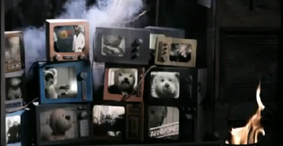
At the beginning, due to the mostly stereotypical themes, the video becomes a relatively redundant performance video. It is only the fact that the band appears to be greenscreened and placed into a toy city that lends the video any truly entropic elements, citizens replaced by plastic dolls, perhaps symbolising how the "fat cats" of the lyrics may understand the public as playthings. Throughout the first half, the video keeps returning to shots of a teddy bear, lying face down, though apparently beginning to move,
as well as referring to other teddies during a shot of many of them on
different tv screens in an almost Big Brother style, and bringing in Goodwin's theories about voyeurism. As teddies are understood as being synonymous with childhood innocence, the audience is intended to be shocked as they are then faced with its binary opposition (Levi-Strauss): an evil-eyed, fanged and clawed giant bear, which then leads other bears into a bizarre and highly entropic teddy bear "uprising",
who then all rampage around the city, gradually destroying it, no doubt an intertexual nod (Goodwin) to Godzilla, or any other monster-movie.
Mumford & Sons - Winter Winds
Mumford & Son's video for their song "Winter Winds" can be understood as a very typical folk performance video. Its mise-en-scene typifies the style and genre: the settings are either picturesque and scenic, obviously in the countryside, or else apparently travel/live performance shots of what appears to be a festival tent, and the costume style is clearly indie/vintage - the lack of deviation from these expected norms causes it to be a highly redundant video. The only hints of entropy are vague at best, during the shots where the band run up the road, adorned with bunting, and attempt to fight against a strong wind in an almost caricatured way, an amplified representation, no doubt, of the song's title and subject, "Winter Winds". It could be that this high redundancy is to establish itself clearly as part of the folk genre to attract its maximum audience, a much smaller, niche group than a pop act, whose music, more generic by nature, would attract far more fans and so would be able to produce videos that could afford to perhaps alienate some audience members in order to be more entropic and artistically exploratory in its themes.
Indeed, the video draws parallels with folk/indie culture where it can. The rural and natural themes are emphasized by low-angle shots of a spade digging the earth, and other close-up shots of bare, muddy feet walking across a corn field, and the youth culture is targeted during the performance scenes, particularly those taking place at a festival - a key social event to their target audience - where there are shots of people drinking beer and, angling at a fan's viewpoint, incorporating shots of the audience and, indeed, people dancing in the crowd, the latter being apparently shot from within the crowd, giving the viewer a sense of association with other apparent fans.
This video, unlike the others, doesn't even have a vague narrative plot, instead being simply a series of shots which have been cut and interchanged. Neither does it have any thematic conflict, making for an easy viewing which suits the tempo of the song and the gentler style of the genre. Indeed, it seems to reject the typical aspects of a music video laid out by Goodwin - there is no sense of voyeurism or an exhibition/sexualisation of female figures. Indeed, though there are some close-up shots of the band, they are not lingering or gratuitous, and are instead seemingly replaced with more scenic shots.
Alex Day - The Time of Your Life
At a contrast to the other videos, I also explored how a minimal/no budget amateur music video would fit different classifications and theories.
To suit the indie genre, generally more eccentric in nature, the video is high
in entropy due to the strange, surreal scenario of building a robot girlfriend, the caricature
d acting and the substitution of characters for cardboard cut-outs, in this case a cutout of character Amy Pond, intertextually referencing (Goodwin) tv show Doctor Who. The video has a self-awareness that it is entropic, and plays up to its comedic elements, having a tongue-in-cheek nature; at one point Alex even lip-syncs to his own backing vocals, and two different versions of the shot override each other in split-screen to accommodate it.
Due to the amateur nature, and lack of any real budget, the mise-en-scene reflects normal day to day life, being shot in the suburbs, and the actors all wearing normal clothing, rooting reality into an otherwise surreal plotline.
Unlike the others, it does indeed have a fully distinguishable plot, which can be most easily compared to Branigan's narrative theory - the beginning of the video introduces the viewer to the characters - singer Alex and the character of the robotic new girlfriend, as well as referencing the cut-out Amy Pond in the role of an apparently ex-girlfriend. Alex initiates the events in the video by activating this new robot girl, the response forming into an odd relationship between them both. The complicating action takes place when the robot discovers the photo of Alex and Amy, and then causes her to fly into a jealous rage and, though initially calmed again, then tries to approach Amy to fight with her. Alex, in attempts to break it up, pushes the robot to the floor, where she lies still. A series of different-angled close-ups with a low editing speed review the outcome of these events. Despite the previously light nature of the video, it ends on the close-ups of the robot girl, who is unable to be revived, lending a more solemn, almost ironic end to the video.