Having been able to go back out and gather photos in the woods, I'm now able to design the outer cover of my digipak.
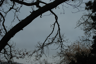
I knew that for both the front and the back of my digipak I wanted a single, unbroken image that continued across both pages, and wanted a trailing branch to link both sides together. Returning to college after the location shoot, I encountered this branch which, with some flipping and rotation on Photoshop, was perfect for this purpose.
In editing, I cropped it down to a practical size with roughly the dimensions of a final outer cover and, using the brightness and contrast options, made the image much brighter and clearer and contrasting the branches as an almost silhouetted black, also using the hue and saturation options to make the sky appear a much stronger blue. I found I had to erase some of the branches, though, to allow enough room for the title and other text - this was quite difficult, as I had to paint over it, using to colour-dropper tool to ensure that the colour I was painting with matched the sky. I also had to use smudge and blur tools to then disguise the boundary between the paint and the photo.
I had initially intended to simply overlay the photograph with my title text, using the fonts "Loved by the King" and "High Fibre" which I favoured in my initial experimentation. However, as the branch was such a dominant feature and took up so much space, I found it hard to position it in a way that didn't mean that the words were obstructed. Instead, I decided to incorporate the words into the branch. Erasing more smaller branches to make room, I lined up the text with the branch and, where the letters did not touch the tree, I painted in new branches to make it appear that they were growing out of it. I even selected other branches from the image and, copying them to a new layer, dragged them onto the letters, flipping and resizing them so they could not be located easily elsewhere on the image.

To allow myself more clear space for next on the back cover, I erased another patch of small branches, and initially aligned my track list to the right, typing them all in lower case in a grey colour, so they didn't have the same dominance as the title, and also in order to match the style in which I presented David Gibb's name - also lower case and grey. However, after experimenting with positioning, I found I favoured a central alignment more, seeing as the title on the front cover was centrally aligned too. However, the presence of bushes and branches made making the text readable extremely difficult. I eventually chose to use a circular gradient to put in a fuzzy white background on a lower layer, keeping its opacity low so it didn't completely blot out the background.

Finally I added things to the cover in order to make it appear more authentic. I found a barcode, and, looking on the backs of my own CD's, found disclaimers that I copied out, giving it an official appearance. I included the "compact disc" logo, as well as the "DVD" symbol, as inside I want to refer to some DVD bonus features on the disc - "making of" or "behind the scenes" clips.
Completed Cover Design - First Draft

I've posted this image onto my Facebook now, in order to get feedback from others so that I can improve it. Having posted it, I've noticed that the sides are a little too wide, so this is something I'll need to revise.
No comments:
Post a Comment