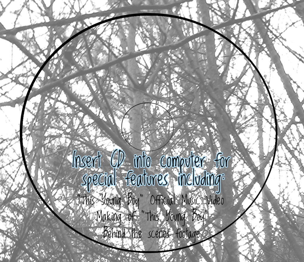
For the right cover, I've used the other of my favourite photos from the shoot:
However, at present it was too dark to use, as I wanted to put some text on this one, informing the consumer of the presence of special features that could be accessed through putting the CD into the computer. To do this, I upped the brightness and contrast, then concentrated on continuing to increase the "brightness" and "lightness" options from the "Brightness and Contrast" and "Hue and Saturation" options respectively. However, after a while it wouldn't go up any more, so I had to overlay the image with a white layer on a low opacity instead. I made sure I was aware of where the CD would be placed by drawing out a rough template.
I made the outlined text in Illustrator, where I could manipulate the pt. size of the lines surrounding the coloured font. I outlined the font with dark grey so that it could stand out against the background - I was still having problems with contrast between the font and the background, so this helped a lot.
Inside Right Cover


No comments:
Post a Comment